
How hard is it for you to maintain a strong, consistent brand presence?
Many SaaS companies have a hard time knowing if they should develop both a company brand and a product brand. That decision gets even more complicated when the company has only one primary product.
It all starts with knowing your customer.
We will look at two brands — Adobe and Intuit — and how they use their company and product logo systems to support each other.
- Consistent brand presentation across all platforms increases revenue by up to 23%
- 90% of consumers expect that their experience with a brand will be similar across all platforms and devices.
- Color improves brand recognition by up to 80%
- Color can improve readership by 40% by making messaging easier to read and more visually appealing. Our brains process color before many other pieces of a brand.
The Importance of Brand
Some companies treat their company and their product as one and the same from a brand and logo perspective — as long as you have a plan for how to scale that system later on. For example, once you launch your second product, what happens? Does the company use a different name, and the product stays the same? Do you rebrand the product so the company can maintain the same name?
In this article, we’ll focus primarily on the logo design phase of the branding process — although the strategy behind it can help inform all iterations of your product branding. Let’s look at the major questions that should determine the direction for your product logo, along with several tech companies that have done it very well.
Who is Your Buyer?
Developing buyer personas is the first step in designing a logo system that will speak to your prospective buyers. Based on your personas, you should be able to determine whether or not you are going to:
- Market multiple products to the same persona and therefore prioritize a strong aesthetic tie between your products so they appear as a complementary solution set OR
- Market your products to multiple buyer personas. For example, if the buyers are different enough from one another, they might warrant a different color palette or type sensibility that can target each persona uniquely and individually.
By knowing your buyer, you are able to make strategic decisions about not just the branding of one product but the branding of the entire system and how it relates to your other offerings and your company as a whole. A great example of the former approach is Adobe and its creative suite of products.
Mini Case Study: Adobe
Many tech companies have ended up with products that, in large part, are targeted at similar buyers. This usually means that there’s value in maintaining a strong aesthetic tie between product logos to lend credibility to all of the products in that suite. Adobe has done a great job with their branding strategy.
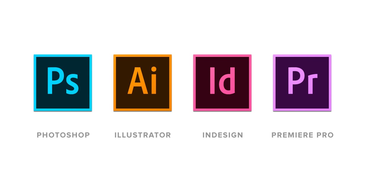
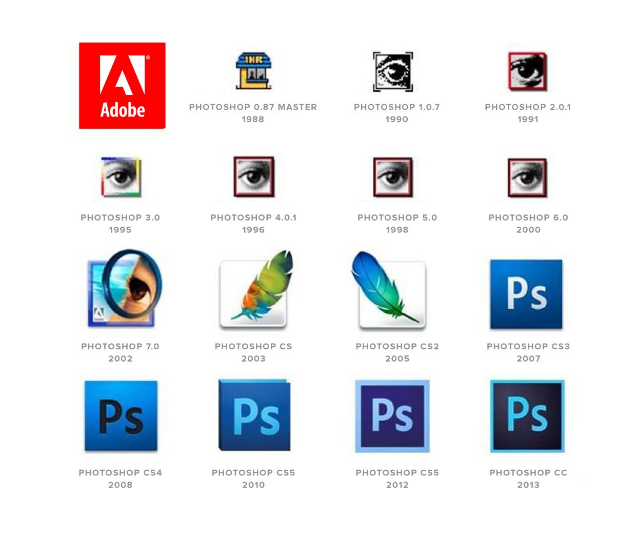
Their primary product line (which includes Photoshop, Illustrator, InDesign and Premiere Pro) maintains a very similar look and feel across each update of the software, in large part because they are targeted towards the same group of buyers.
All of their products are focused in the rapidly-changing creative space, so the look and feel of their logos has adapted fairly quickly over the years. They prioritize staying in touch with the design trends of the time, while still maintaining tight consistency among all products.
The direction that Adobe took is not for every company, however, especially those whose products might benefit from differentiation. The next question you have to ask is, “How will your buyer perceive the value of your product?”
How Much Brand Equity Do You Have?
When determining product branding strategy, companies are often faced with two options: maintaining fidelity to the existing company brand OR differentiating the product through an entirely new logo and branding system.
A key element of this decision is your existing brand equity. How do your current and prospective customers perceive your brand’s value — and what role should that play in your product branding strategy? Let’s take a look at a larger technology brand that tackled this question.
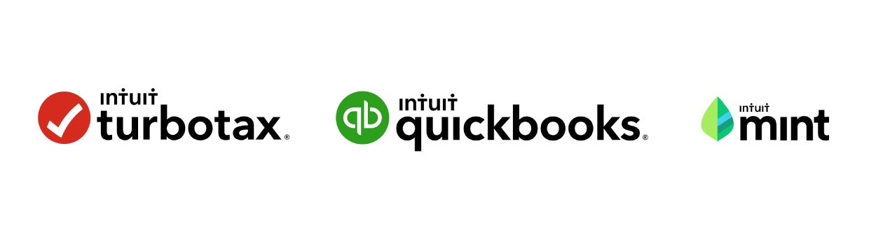
Mini Case Study: Intuit
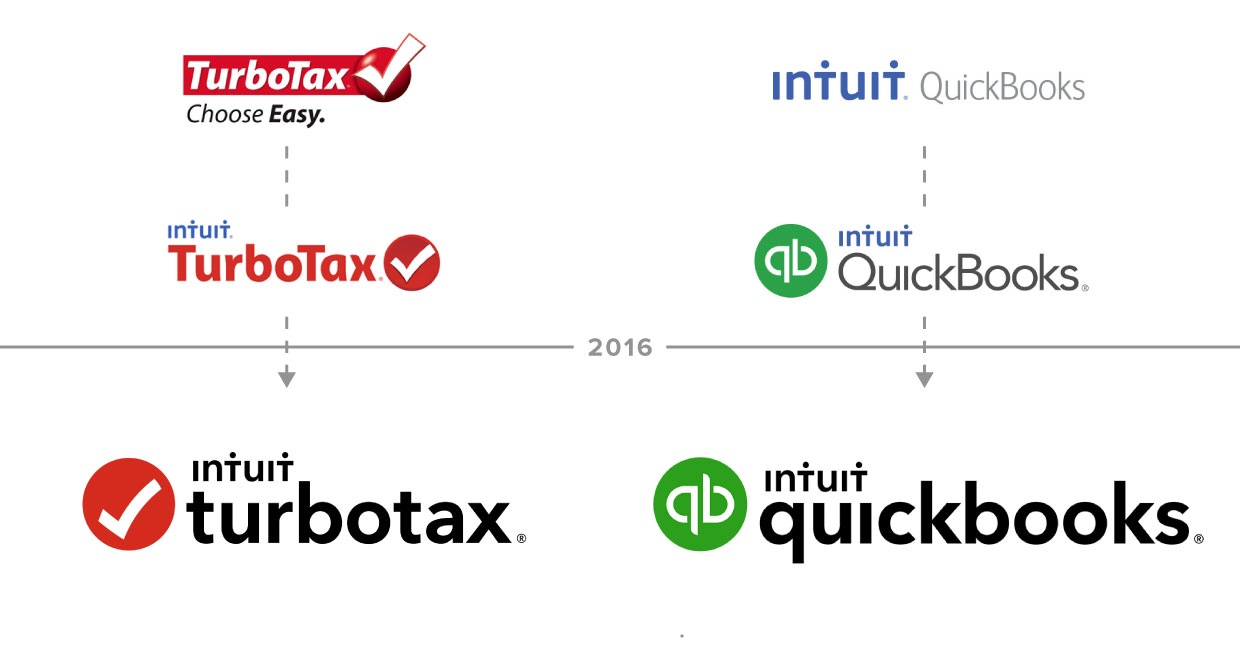
Leading up to 2009, Intuit had two primary products: TurboTax and QuickBooks. In September of that year they acquired Mint.com. They were faced with the challenge of how to bring the Mint brand into alignment with their other products.
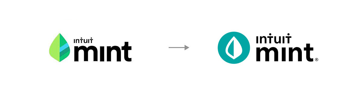
It was not until seven years later that they finally updated the Mint logo. That’s likely because, at the time of acquisition, Mint had a strong consumer base that trusted the brand they were familiar with. In 2016, Intuit made a step towards brand continuity by bringing TurboTax and Quickbooks into strong visual alignment.
Although they updated the Mint logo at this time as well, they did not bring it into complete alignment with their two other products. They likely did this to protect brand equity and maintain the buyer’s trust in and affinity for the Mint brand by not changing the look and feel too drastically.
For instance, they kept the playful, fresh-feeling leaf theme while introducing the Intuit word mark to bring the new product into closer visual alignment with the family of products and add some of Intuit’s brand equity to Mint.
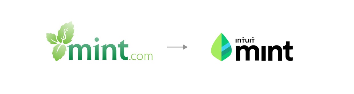
Their product suite maintained continuity in each of the logos from the size and hierarchy of the icon, type and intuit word mark allow for strong uniformity and transference of brand equity — all while keeping Mint’s unique look and feel that attracted so many of its buyers in the years before intuit.
Two years later, in 2018, Intuit updated the mint logo to fully match their family of products. They introduced the Intuit circle into the brandmark, and maintained a similar leaf form inside of it. Although there are mixed reviews on this update, it is clear that Intuit was intentional about the gradual transition of mint from it’s own brand with a unique following to a product that is fully integrated within the larger and more established intuit family of apps and services.
This Intuit case study serves as a great example of the kind of obstacles you might come across if you decide to expand or update your offerings over time. Be pragmatic and intentional, consider your audience and buyers, and don’t let your feelings get in the way of the right decisions for your brands.
Be pragmatic and intentional, consider your audience and buyers, and don’t let your feelings get in the way of the right decisions for your brands.
Once you have considered who will be buying your product and how those people perceive the brand’s value, it is now time to think about the competition.
How Do You Stack Up Against the Competition?
The competitive landscape is the third primary consideration in determining the direction of your product logo and brand system. Assuming that a strong name with a simple, yet compelling logo is a requisite for any successful brand, here are the key factors to consider in regard to the competitive landscape:
- Does the buyer value a suite of products that can integrate with each other to accomplish a variety of tasks?
- OR Are they looking for one niche and tailored product to fit a very specific need?
- Does your parent brand carry enough equity to warrant the inclusion of the company’s brandmark so that it weights the competition scales in your favor?
- OR Will the inclusion of the company wordmark simply serve to dilute the brand of the product?
As a smaller company with one primary product, this is an important consideration — especially if your product will be going head-to-head with another one that’s already on the market. If that is the case, it can be wise to give your product its own name to make it easier for the consumer to compare product versus product as opposed to product versus company.
Or perhaps your company brand has a professional, corporate tone but you find, through research and analysis, that your product should be positioned as more approachable in order to stand out from the competition. That should be strongly considered in the logo design process.
Either way, thinking intentionally about how your product or product suite will be viewed in the marketplace by your potential buyers is essential to making informed design decisions. Be careful to let market research guide you as opposed to “gut feelings” around the importance of having a branded house or house of brands.
Positioning your product and its logo to speak to buyers’ real market problem is key. Once you know where your offering stands in regards to market problems, brand equity, and competition, you should see a clear path toward building a brand that is ready for future growth and expanded product offerings.
If you need help with your product branding strategy, let us know — we’d be happy to help.
The First Thing to Do After Reading this Article
Pull your brand sheet and print it out large or display it on a screen. Gather a few of your visual communicators together and talk about your use of color, shapes, and overall feel. Do your logo(s) communicate what you intend? What adjustments do you need to make?


