5 Ways To Boost Conversions On Your B2B Landing Page
Whether it’s a white paper, toolkit, or template, your content creation efforts are focused on one thing: engaging prospective clients with valuable, relevant thought leadership. Once you’ve created your high-value resource, you need to leverage it in your content marketing efforts through a concerted promotional strategy — and then capture those leads through an optimized landing page.
Landing pages are an essential component of a successful inbound marketing strategy. In fact, research from HubSpot shows that companies see a 55% increase in leads when they up their number of landing pages from 10 to 15. Landing pages are the lynchpin of your lead generation efforts, so make the most of your B2B landing page with these best practices.
1. Simplify Your Layout
Every element of your landing page, from design to headlines to user flow, should make it incredibly easy to convert. Any unnecessary steps or obstacles to submitting their information will cause users to flee your page.
Online audiences tend to skim pages of information, rather than read them all the way through. They’re looking for what they want to know, so make sure you address that answer quickly and clearly on the landing page. Start with a strong, concise header message. It will be the first thing a visitor notices once they arrive, so make it as specific as possible.
Keep the body of your landing page short and sweet by using sub-headers, scannable bullet points, and bolded text or italics for emphasis. A cluttered or dense landing page will only distract users from the ultimate goal: converting. Highlight the value of what you’re offering to solve the prospect’s needs and make their job easier.
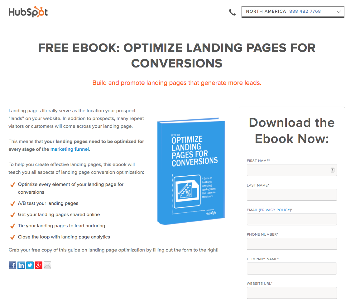
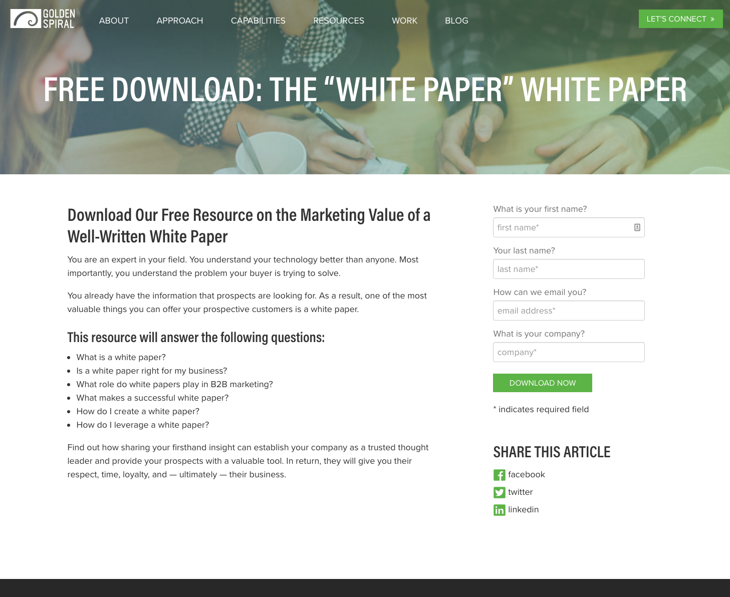
Another way to enhance the simplicity of your landing page is to remove all other navigation items from the menu of that page, like HubSpot has done below. Once someone has landed on a gated resource, you don’t want people going elsewhere on your site — you want them to convert on that page. In those cases, removing navigation options from the header and the footer creates a clear path to conversion. Focus on making each element of your landing page clear, simple, and intuitive in order to increase subscriptions and sign-ups.
2. Clarify What You’re Offering
The primary question that visitors have when visiting your landing page is, “How does this benefit me?” That’s why it’s essential that you make your content’s business value evident at first glance. Emphasize your value proposition through concise, compelling copy.
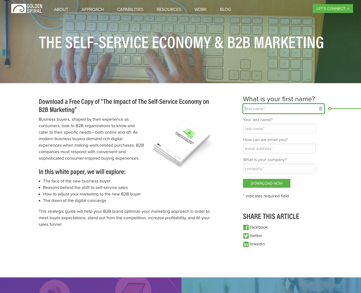
Your landing page should clearly articulate the value of what is being offered so that there is a mutually beneficial exchange. Instead of a value proposition that simply says, “Download our white paper now!” consider a strong, clear value proposition such as:
In this white paper, we will explore:
-
The face of the new business buyer
-
Reasons behind the shift to self-service sales
-
How to adjust your marketing to the new B2B buyer
-
The dawn of the digital concierge
Readers must be convinced of your resource’s value before they are willing to trade their contact information for access. The negotiation happening here is one of trust: you not only need to convince the reader of your content’s value before they download; you also need to make sure that the resource they receive meets those expectations. A low-value resource that doesn’t meet expectations is worse than none at all when it comes to building trust.
Your landing page’s call-to-action (CTA) will be one of the biggest determiners for whether your user converts or not. Make your CTA button as eye-catching as possible and experiment with your CTA messaging to see what works best. Do more people respond to a short and sweet CTA, like Sign Up? Or does a more value-specific message, like “Sign Up for Our 2-Week Email Series” get more submissions? Research, test, measure, and adjust accordingly.
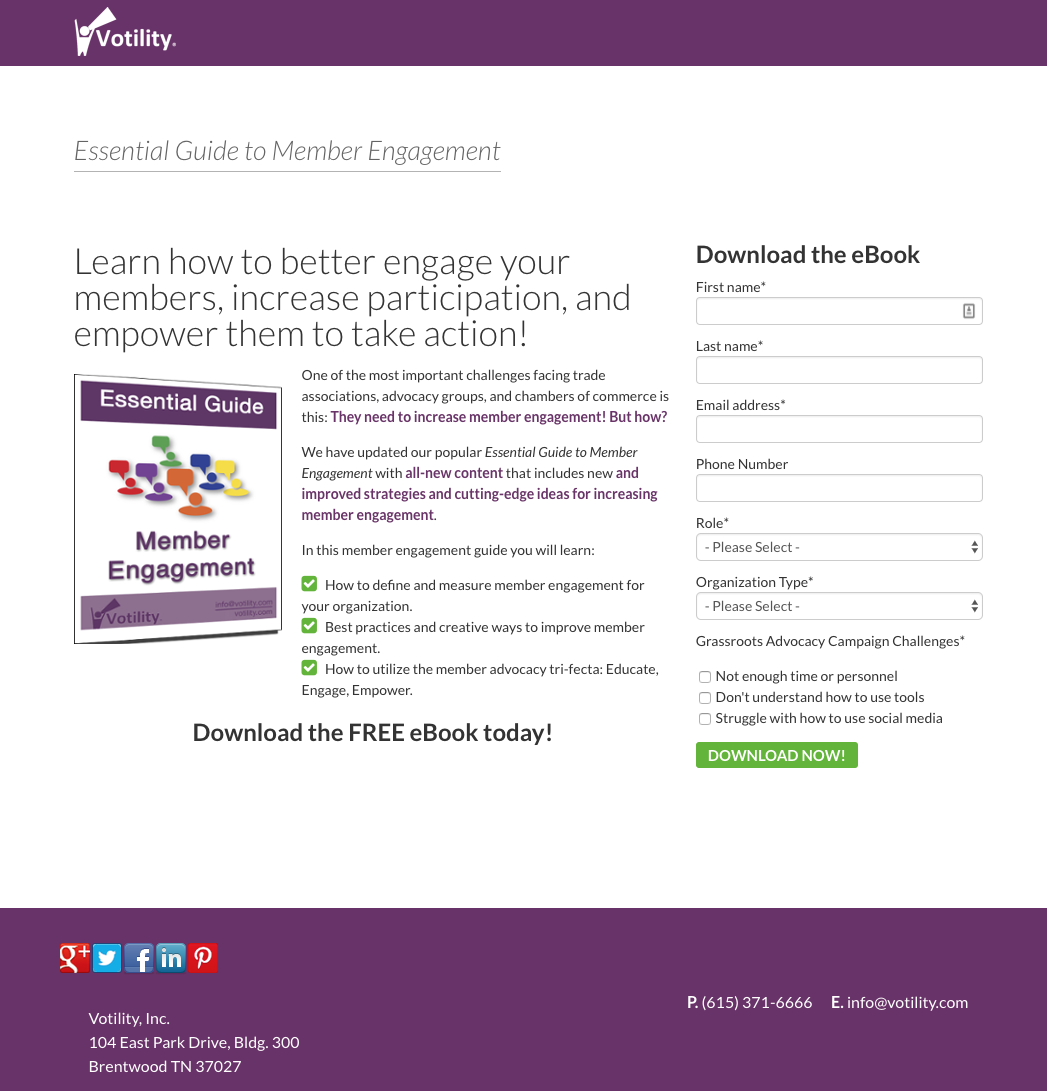
When the user clearly understands its value and it answers questions that they already have, they are much more likely to share their information in exchange for a download. This landing page from Votility is a great example of a crystal clear value proposition.
3. Humanize Your Page
One rule to keep in mind throughout your marketing (but especially when it comes to your landing page) is that people like working with people. This is especially true in the tech industry where companies tend to lead with their software’s features, rather than with the teams behind them.
A sterile and impersonal landing page doesn’t evoke the personal connection that you want buyers to feel. Instead of stark stock images, consider including pictures with a more warm, friendly, human element to them. Adding images that include people — bonus points if they are actually part of your team — will engage users and attract attention.
Another key part of having an accessible, approachable landing page is including a mock-up of the resource they will be downloading, like in the example below. This contributes to the user’s understanding of what they will be downloading and helps them understand its value (and why its worth trading their information to get it).
4. Optimize Your Form
You’ve invested significant time and resources, so don’t make the mistake of providing your content assets with the click of a link! While this provides immediate access for the prospect, it fails to capture any lead information. To optimize your content as a lead-capture tool, make sure to include a registration form on your landing page.
Make your form as friendly and inviting as possible by increasing the size of your fields and removing all unnecessary steps to increase conversions. Don’t make the mistake of requesting too much information at this stage of the customer journey. Even if they are interested in what you have to offer, the reader will be highly wary of answering dozens of questions about their position and budget in order to access it.
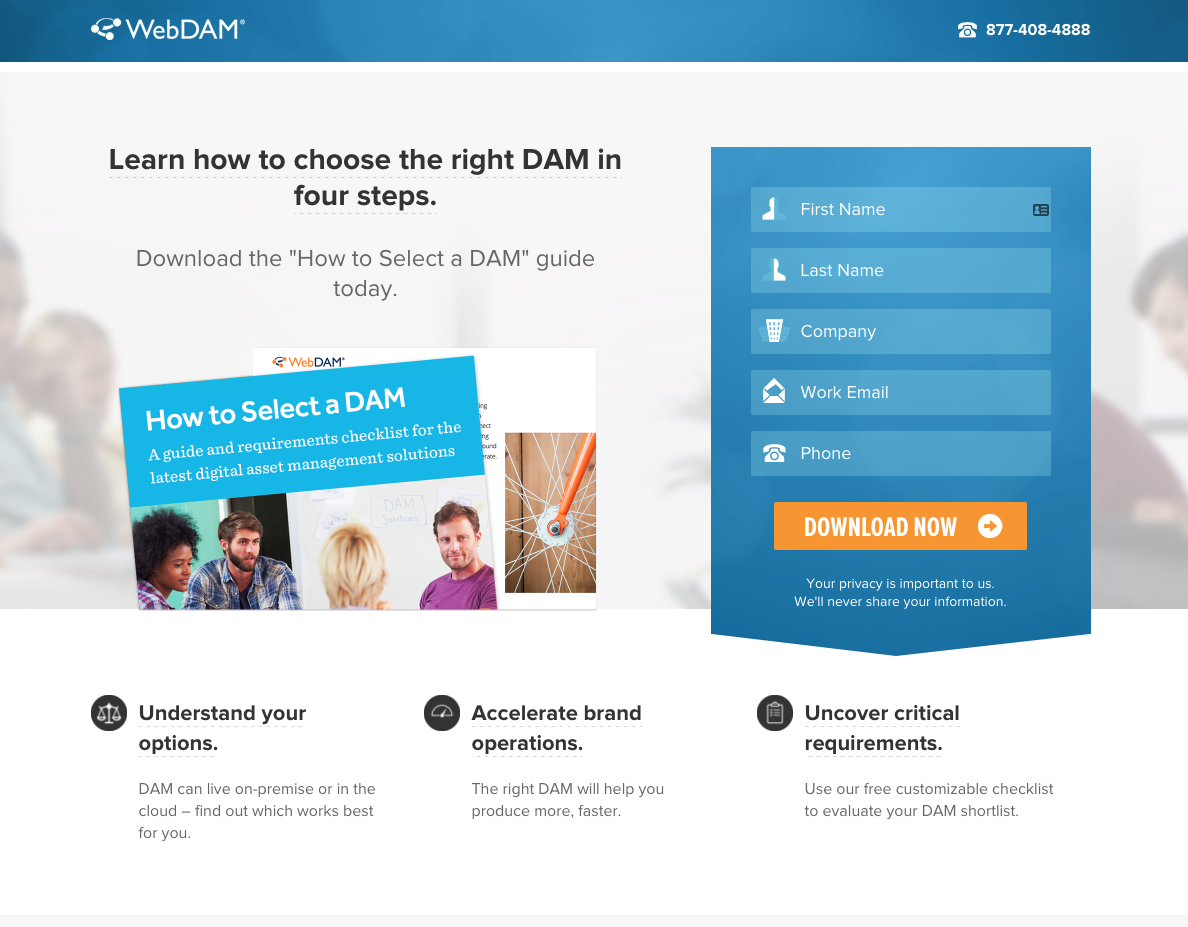
In your form, request only the basics of what you need (usually first name, last name, company name, email address, and maybe phone number).The landing page below is an excellent example; they use clear, sleek icons to indicate the info needed. Anything else you need to know, you can gather in your follow-up interactions. For now, it’s all about creating the clearest path possible for the user to submit their contact info.
5. Continue to Experiment
When it comes to inbound lead generation, your landing page is one of the most powerful tools in your arsenal. When building your next landing page, the elements in this post provide a great starting point, but landing pages should be unique to your business and what you’re offering — it’s not a one-size-fits-all solution
Continue to tweak your landing page to see what gets the best results. Conduct A/B testing on each of the above practices to increase leads, sign-ups, and submissions. Small changes can make a big difference, and there’s always room for improvement. If you need help optimizing your landing page, feel free to get in touch!